NIKKI ORSOLINI
︎ABOUT
︎SHOP
︎INSTAGRAM
︎︎︎︎︎︎︎
Washington, DC
VCU Graphic Design 2021
Sept. 1999 –
???
Type Design
ITALIAN INSPIRED WOOD TYPEFACE: SENIOR PROJECT
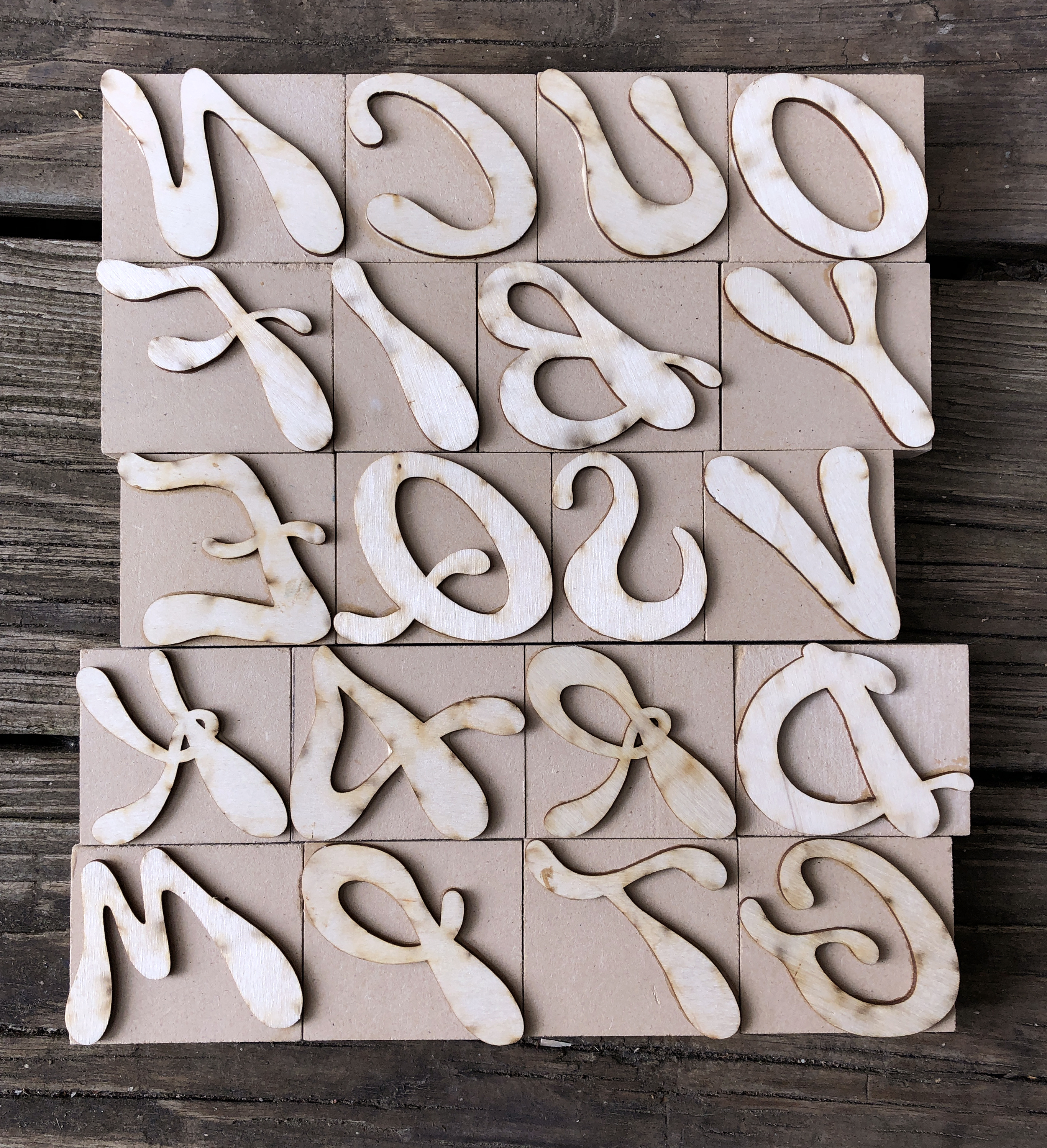
For my senior project, I created a typeface inspired from Italian wood type history. I then used it to craft my own set of wood type. VCUarts has taken my interest in typography from the digital realm into the physical world with processes like letterpress and screen printing.
PHASE 1 — SKETCHING & RESEARCH
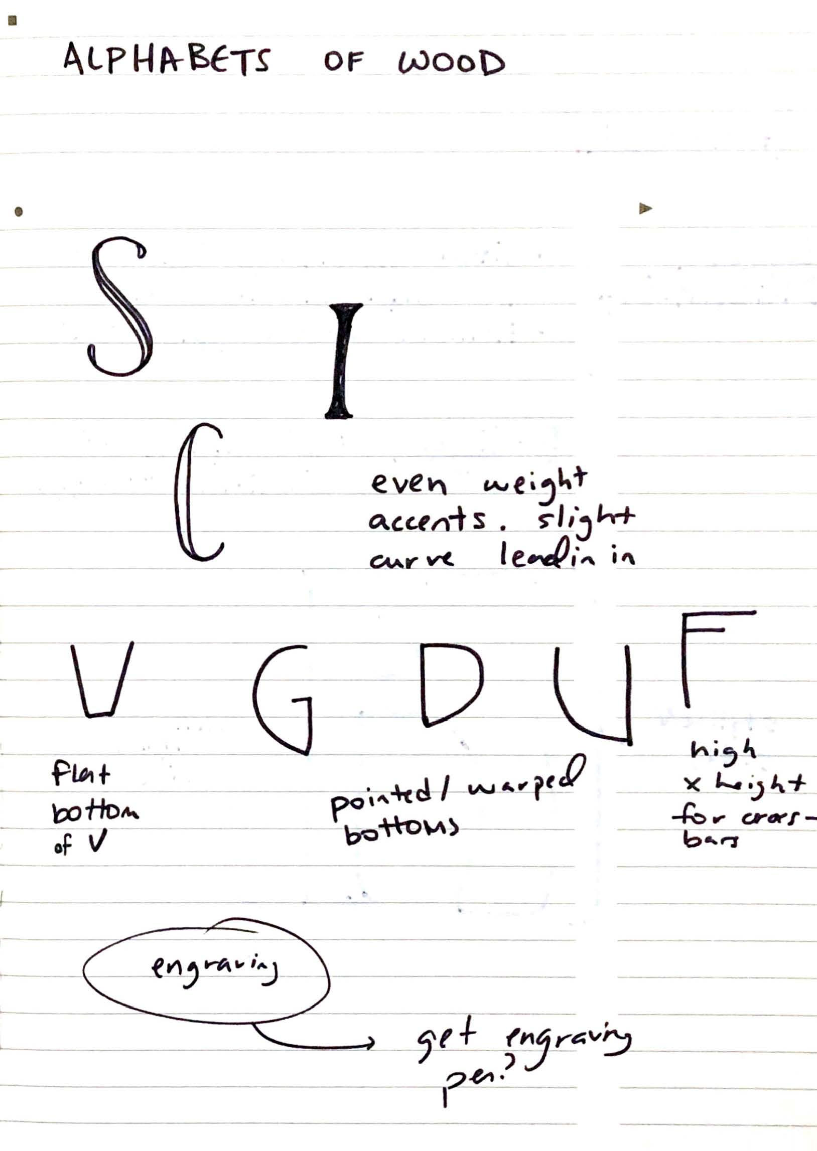
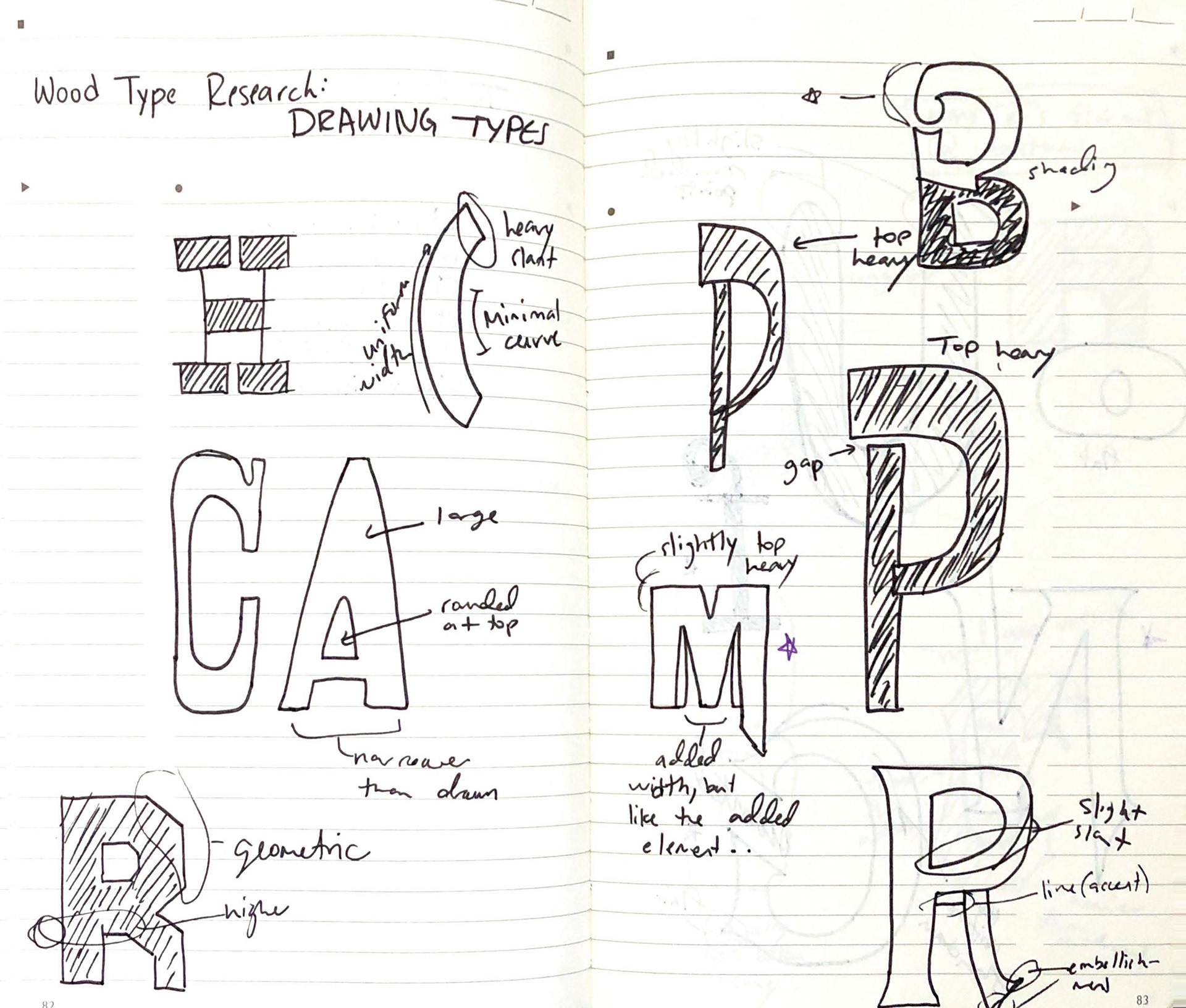
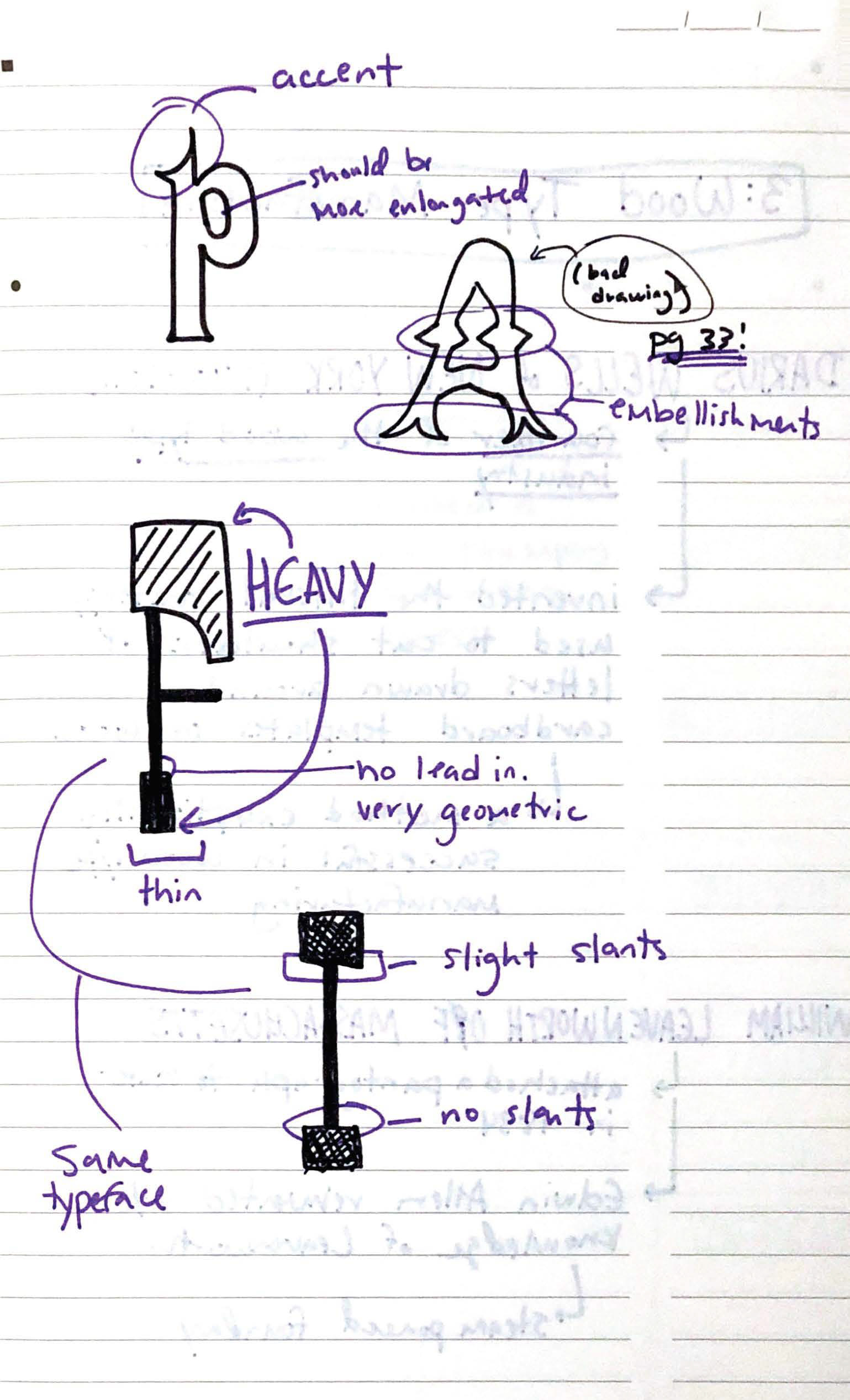
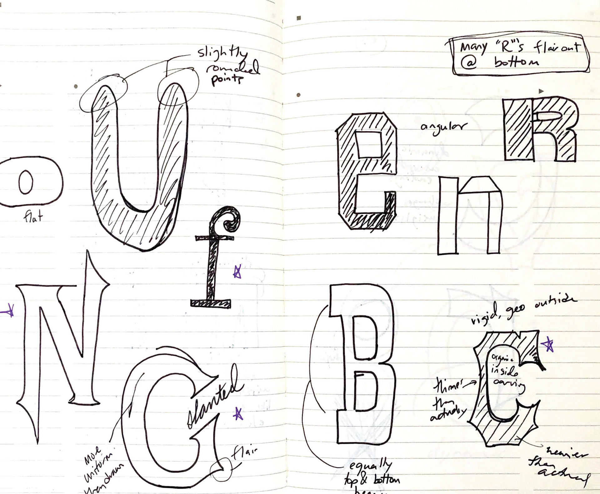
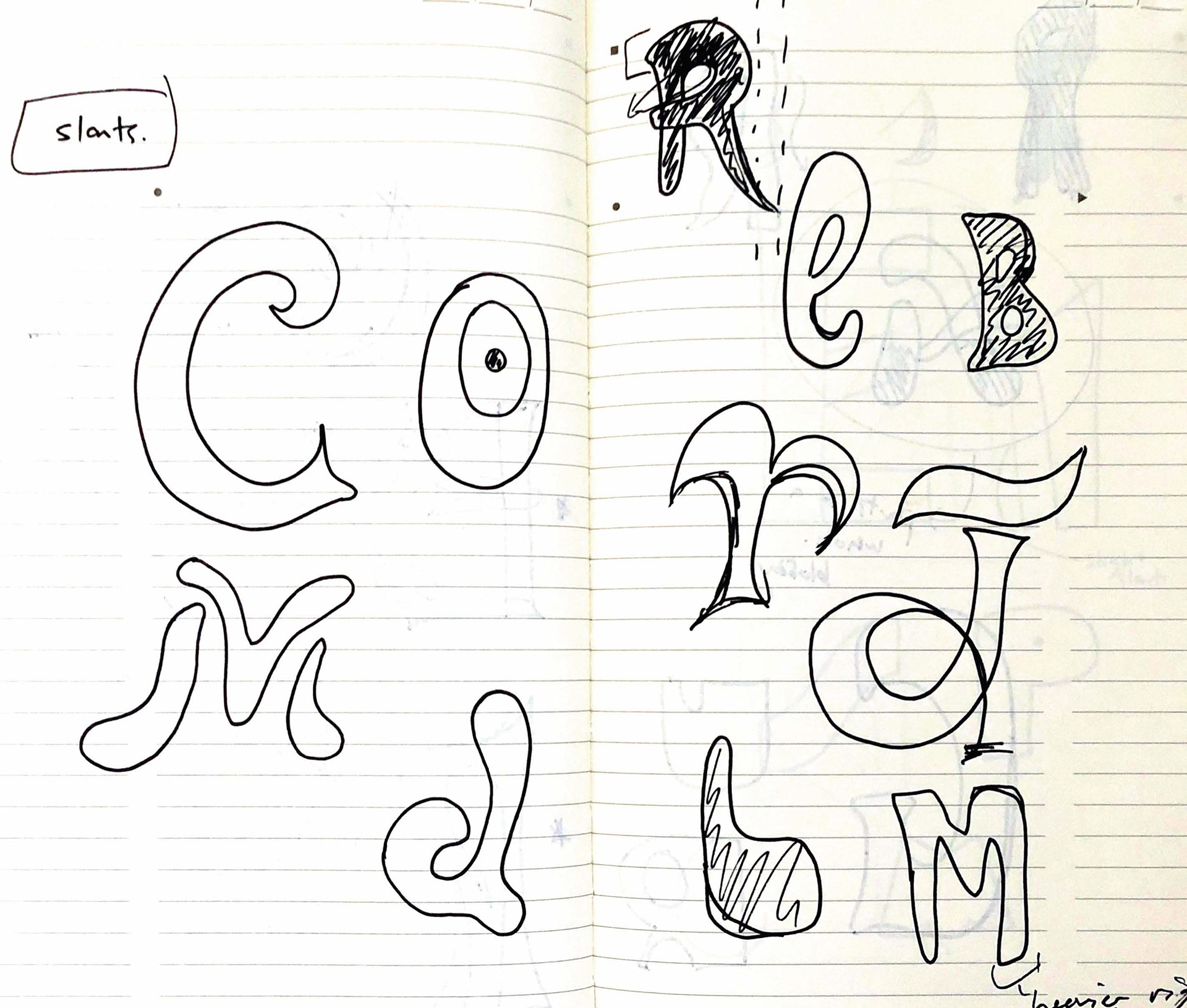
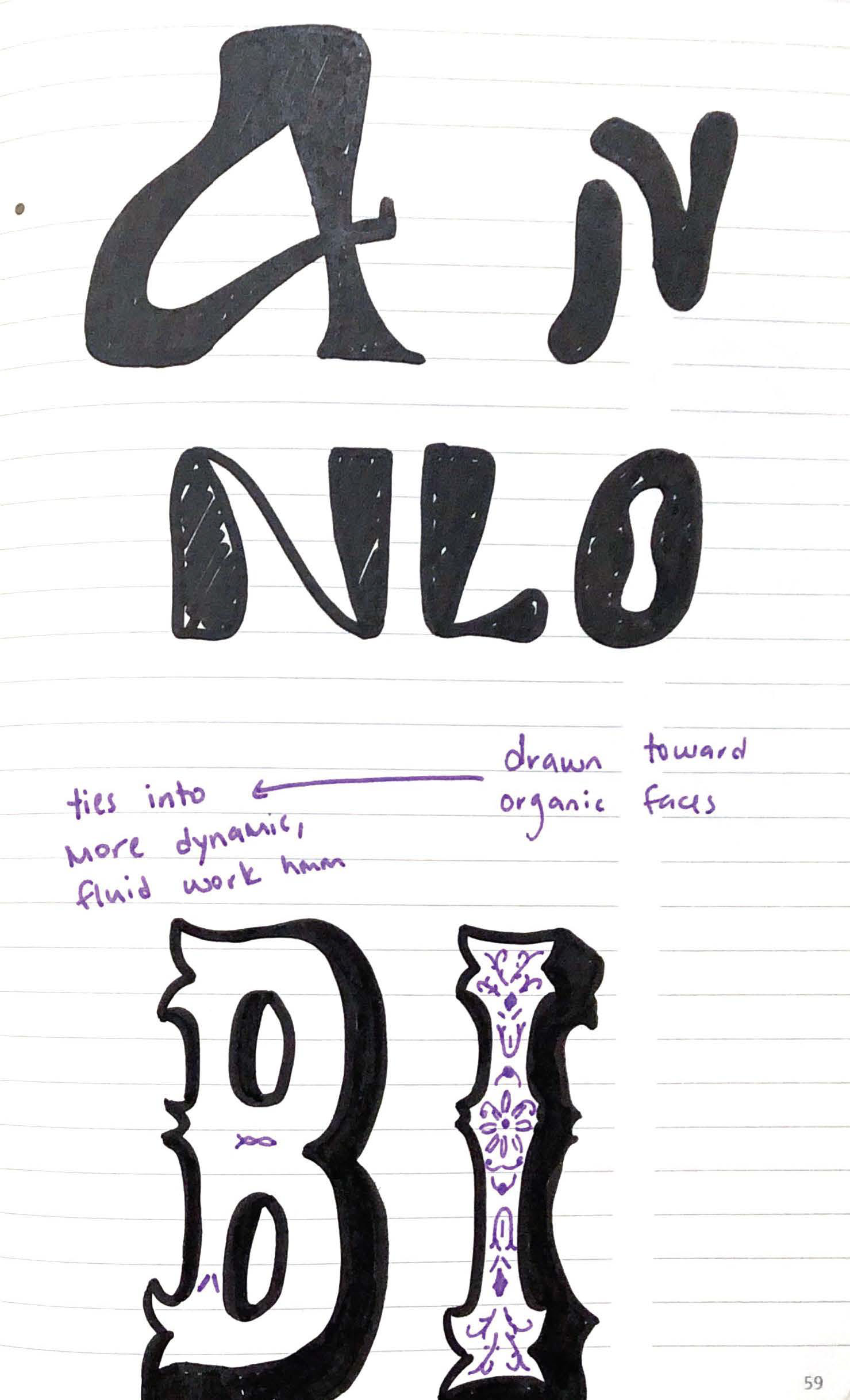
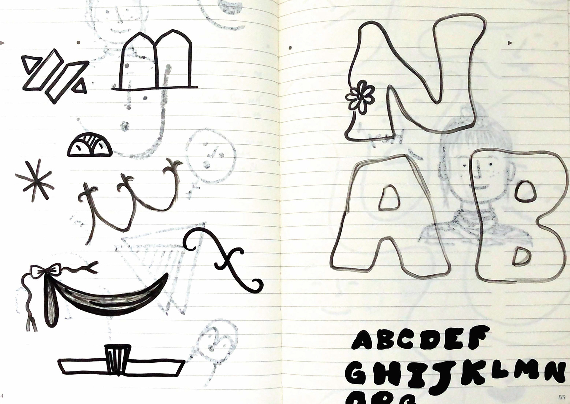
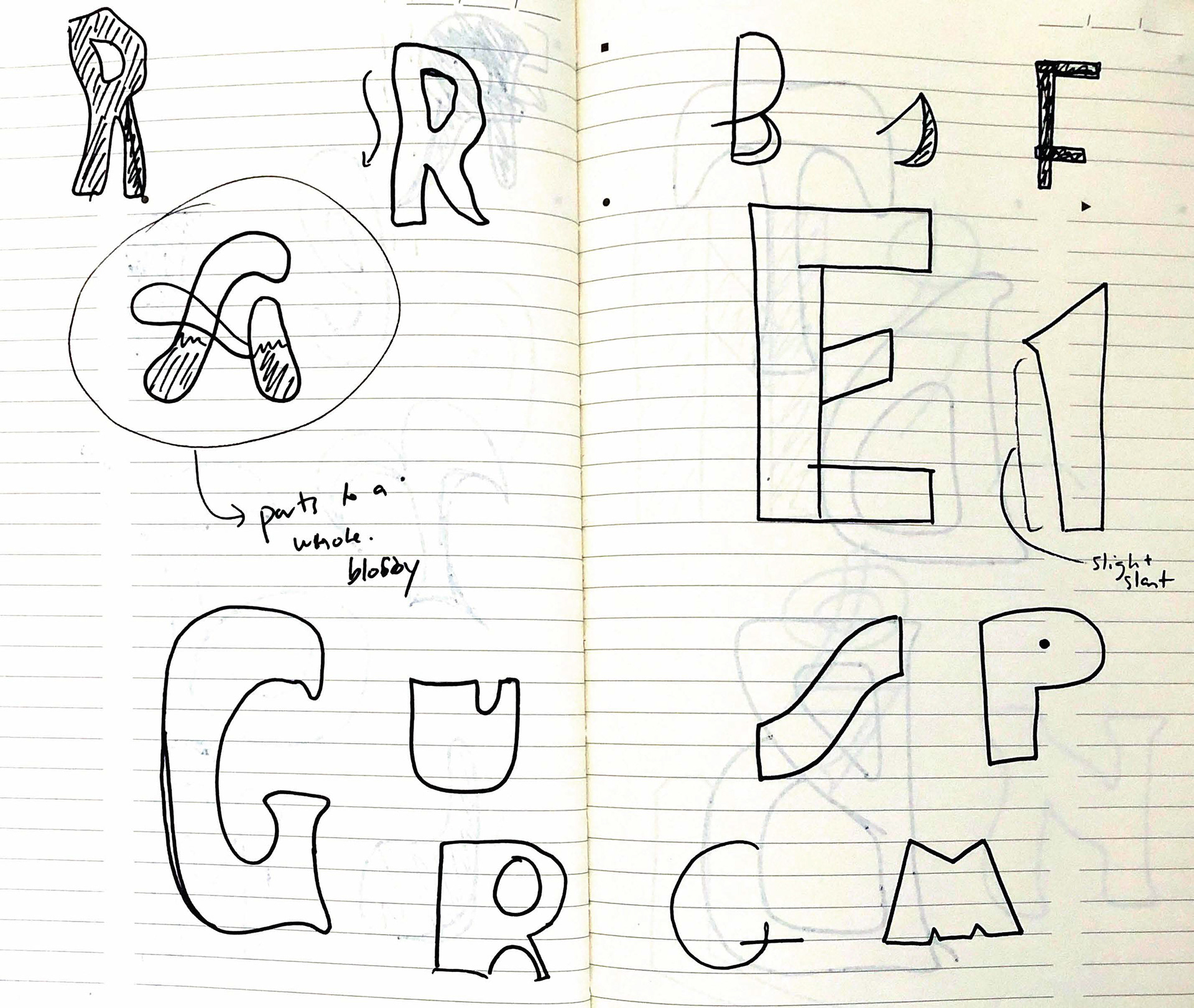
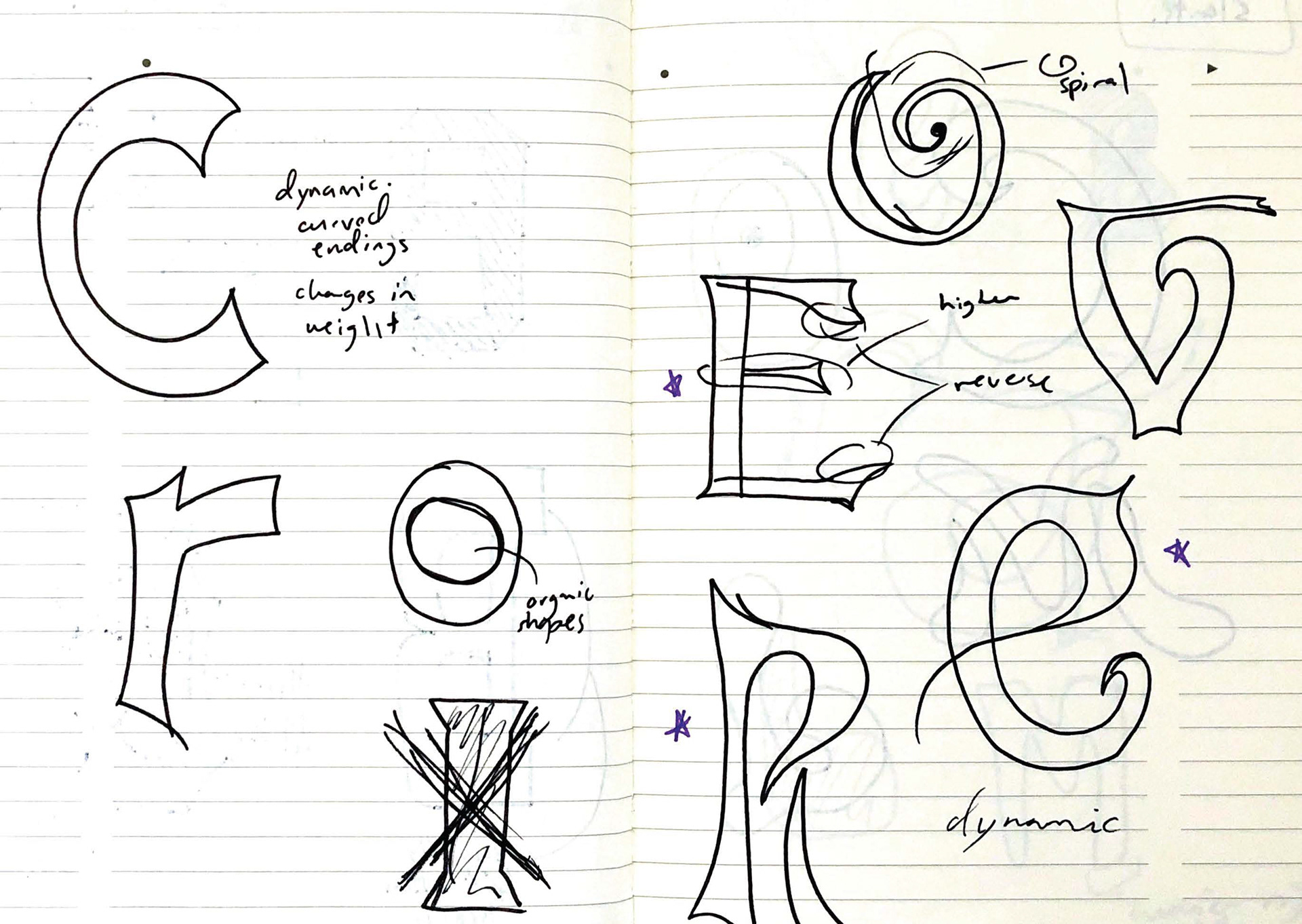
I got most of my inspiration from some books—mainly 'Alphabets of Wood'—and by talking with Scott Moore of Moore Wood Type. I began by reading, taking notes, and redrawing forms that stood out to me. As I was going through this process, I was realizing I was drawn to the particularly organic faces. Outside of class a lot of my work incorporates freeform shapes and organic forms as well. This lead me to pursue a more organic design for my final typeface.
![]()
![]()
![]()
![]()
![]()
![]()
![]()
![]()
![]()
PHASE 2 — DRAWING & CREATING
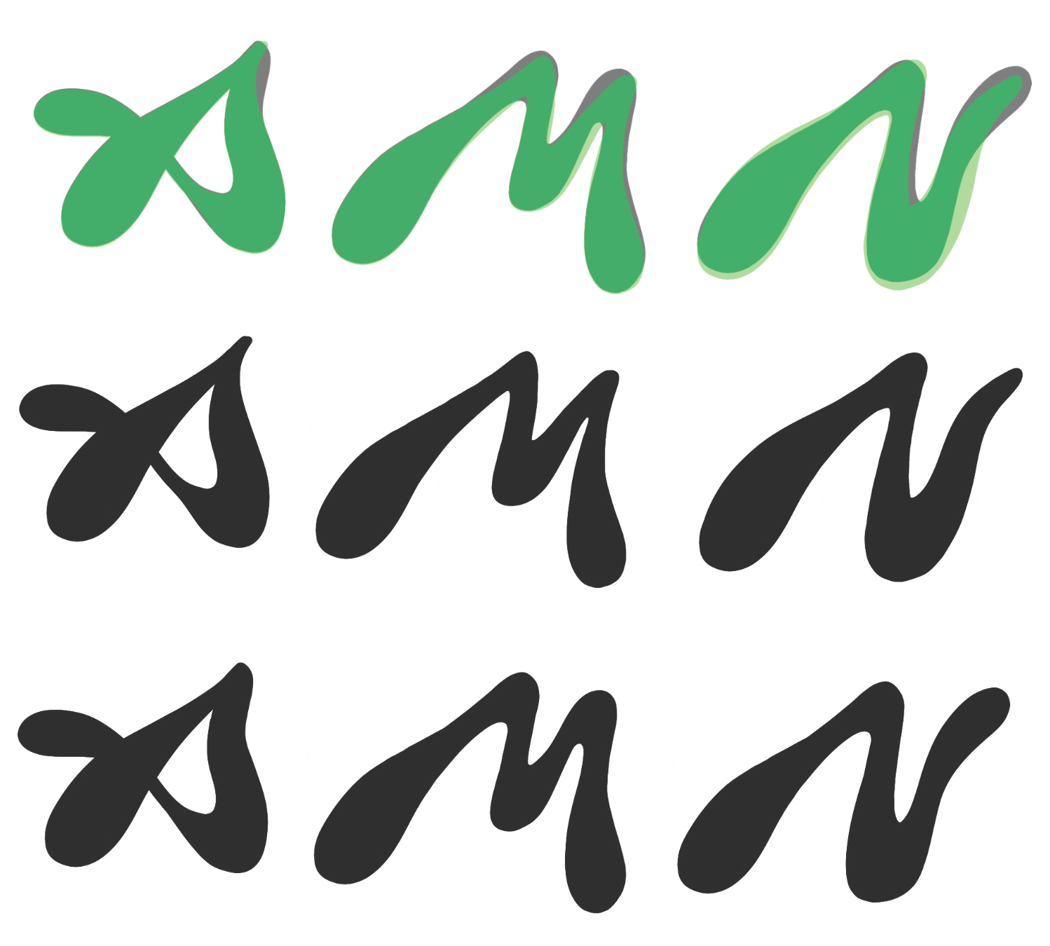
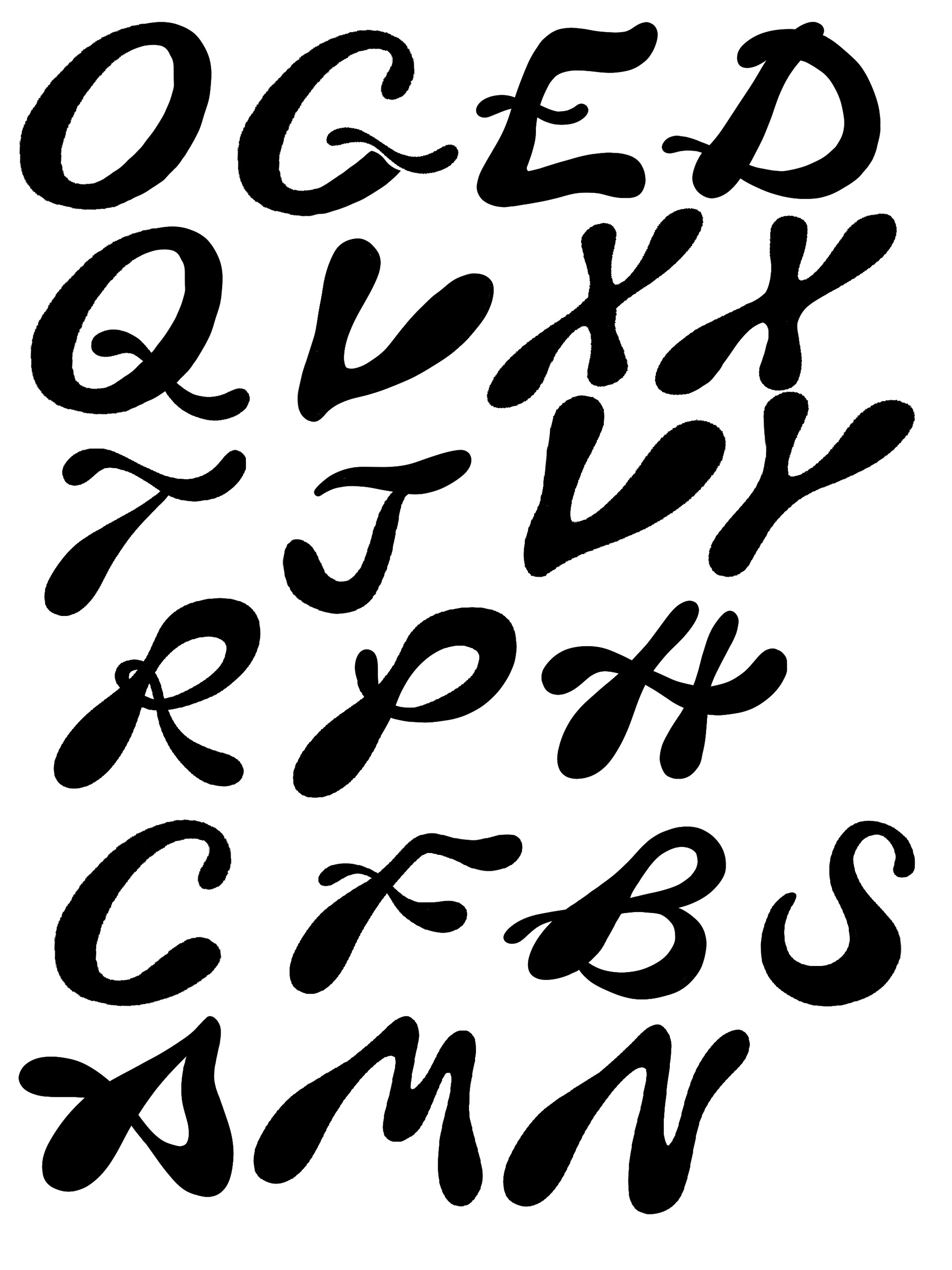
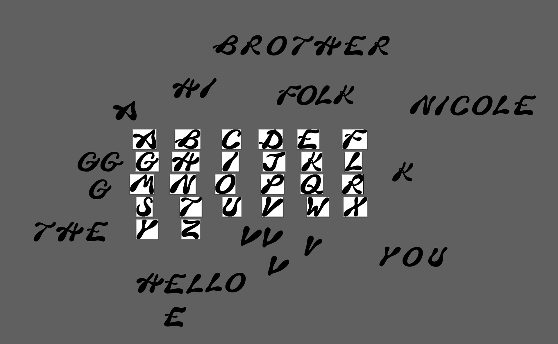
After redrawing a handful of typefaces, I started to deviate into creating new potential letterforms. I quickly transferred over from working in my sketchbook to working in procreate. This allowed me to quickly and easily try different versions of the same character.
![]()
![]()
![]()
![]()
PHASE 3 — CUTTING & ASSEMBLING
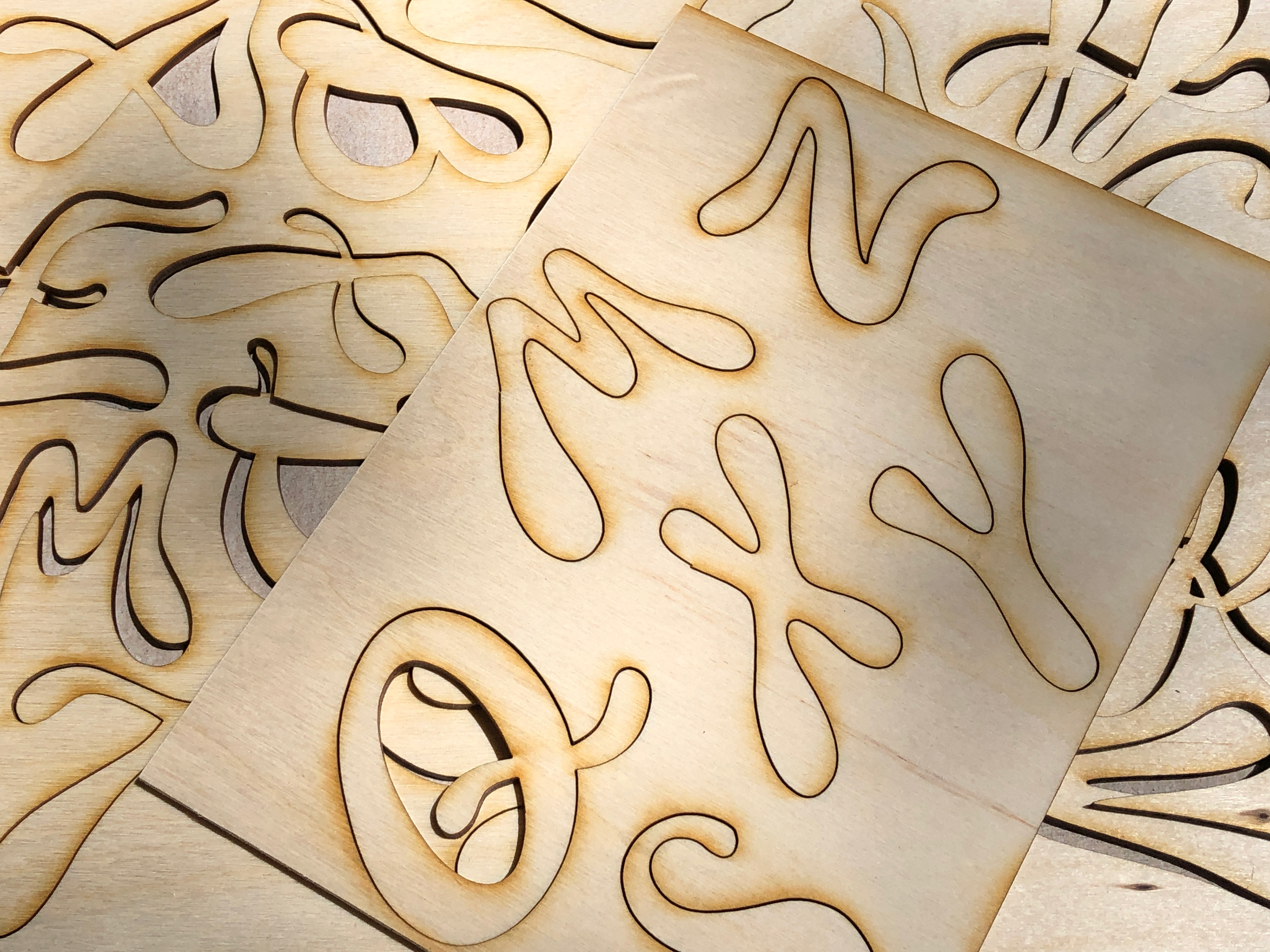
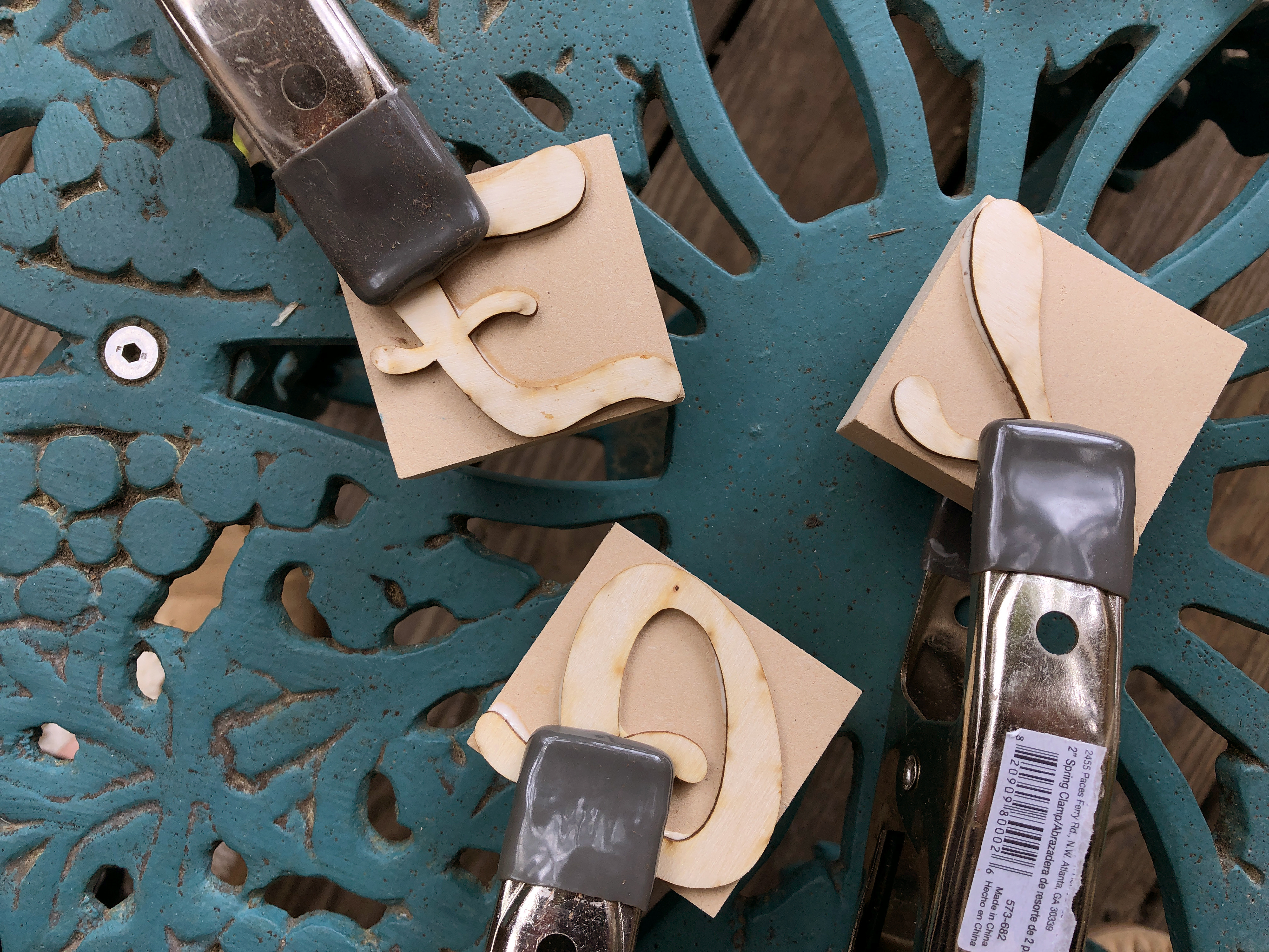
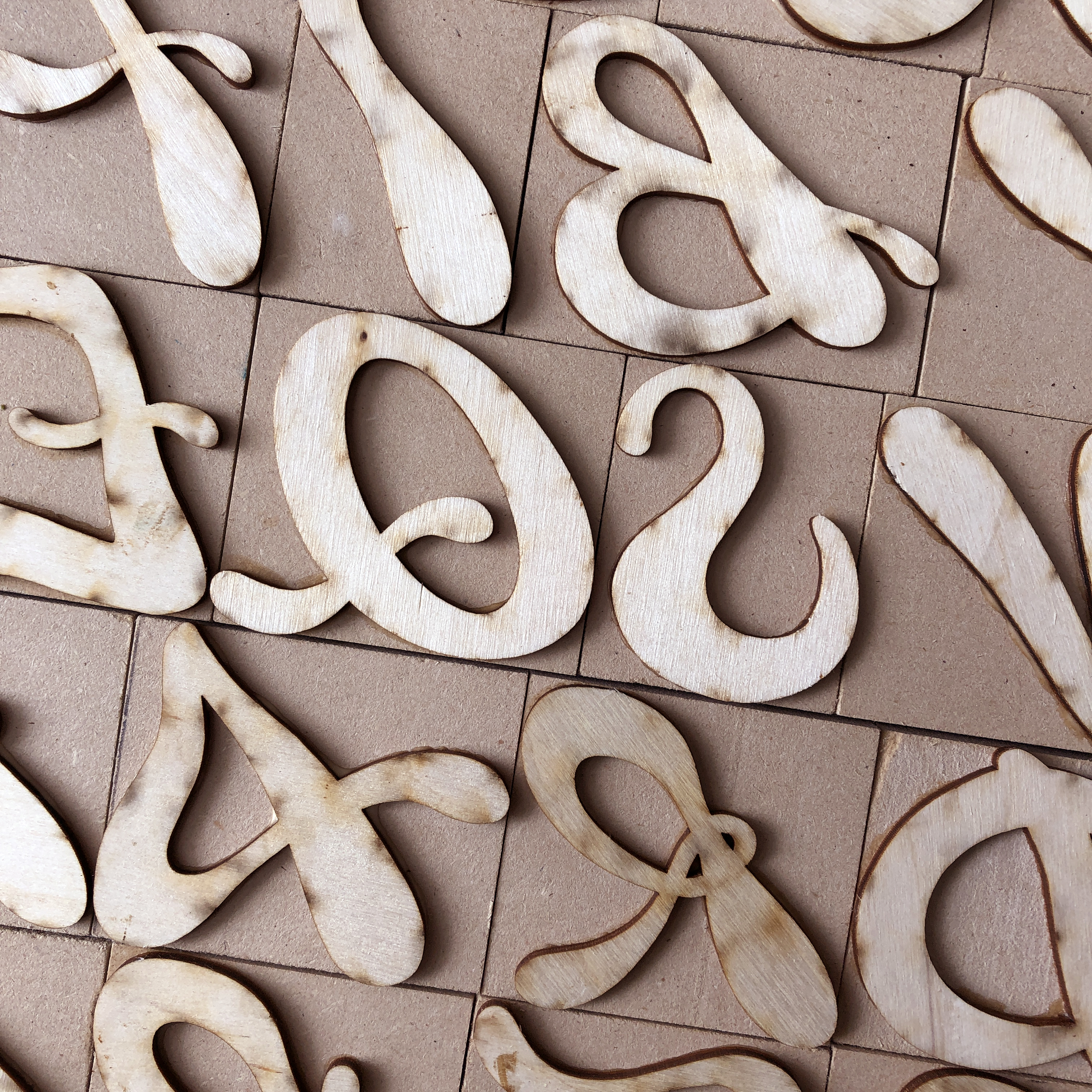
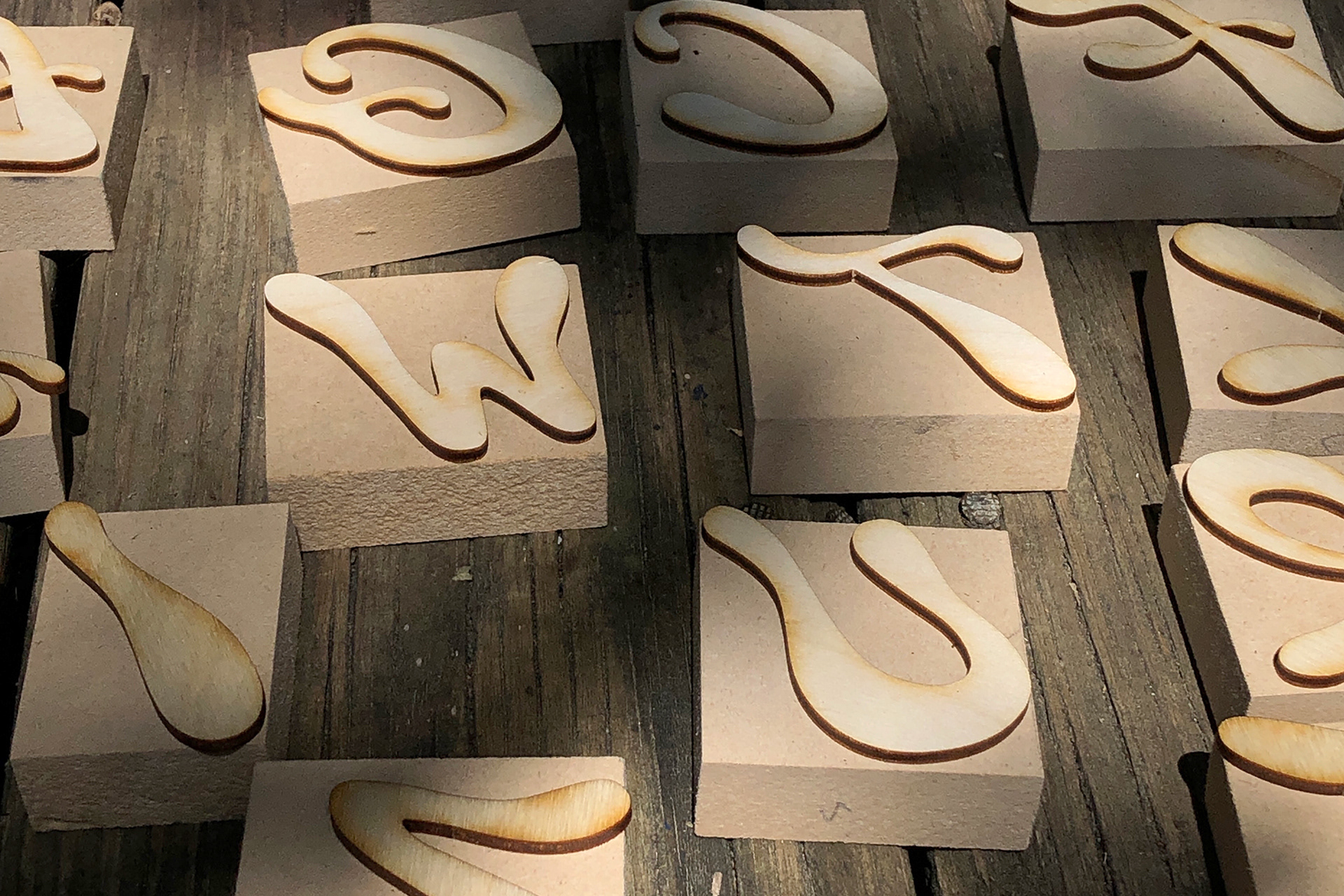
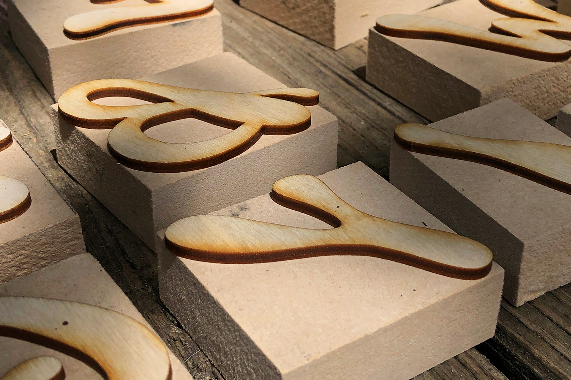
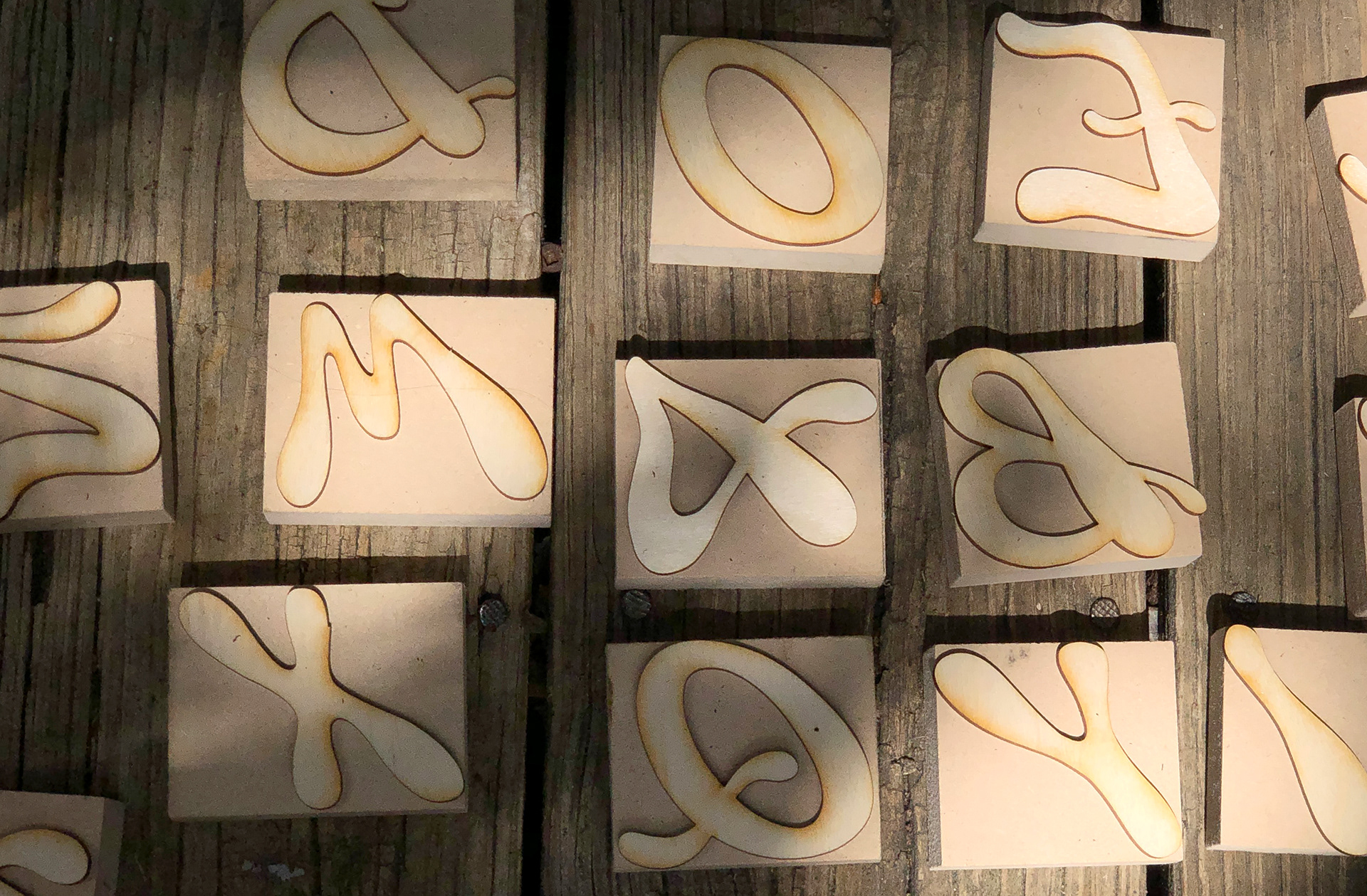
Once the final tweaking of letterforms was complete, I laser cut them into 1/8 in plywood. Per recommendation by Scott Moore of Moore Wood Type, I decided to assemble my blocks using a 'stacked type' method. This is easy to do at home and requires, 3/4 in MDF board, 1/8 plywood, wood glue, and plenty of packing to make it fully type-high.
![]()
![]()
![]()
![]()
![]()
![]()
![]()
FINAL TAKEAWAYS
Over my time at VCU, my work has evolved to being driven by materiality and tactility. I now start every project away from the computer and use it as a supplemental tool rather than a primary tool. I wanted to explore that aspect in my senior project by drawing inspiration for the typeface from the physical world, bring it digital for the designing process, then back physically when creating the wood type. I am very excited about the final result and feel that this typeface that is truly ‘me’. It truly synthesizes together everything I’ve learned throughout my time at VCU.
For my senior project, I created a typeface inspired from Italian wood type history. I then used it to craft my own set of wood type. VCUarts has taken my interest in typography from the digital realm into the physical world with processes like letterpress and screen printing.
PHASE 1 — SKETCHING & RESEARCH
I got most of my inspiration from some books—mainly 'Alphabets of Wood'—and by talking with Scott Moore of Moore Wood Type. I began by reading, taking notes, and redrawing forms that stood out to me. As I was going through this process, I was realizing I was drawn to the particularly organic faces. Outside of class a lot of my work incorporates freeform shapes and organic forms as well. This lead me to pursue a more organic design for my final typeface.
PHASE 2 — DRAWING & CREATING
After redrawing a handful of typefaces, I started to deviate into creating new potential letterforms. I quickly transferred over from working in my sketchbook to working in procreate. This allowed me to quickly and easily try different versions of the same character.

PHASE 3 — CUTTING & ASSEMBLING
Once the final tweaking of letterforms was complete, I laser cut them into 1/8 in plywood. Per recommendation by Scott Moore of Moore Wood Type, I decided to assemble my blocks using a 'stacked type' method. This is easy to do at home and requires, 3/4 in MDF board, 1/8 plywood, wood glue, and plenty of packing to make it fully type-high.
FINAL TAKEAWAYS
Over my time at VCU, my work has evolved to being driven by materiality and tactility. I now start every project away from the computer and use it as a supplemental tool rather than a primary tool. I wanted to explore that aspect in my senior project by drawing inspiration for the typeface from the physical world, bring it digital for the designing process, then back physically when creating the wood type. I am very excited about the final result and feel that this typeface that is truly ‘me’. It truly synthesizes together everything I’ve learned throughout my time at VCU.